Introduction

In modern web design, customized sidebars featuring user profiles and dynamic widgets can significantly enhance the user experience. By displaying personalized information and interactive elements, such as user avatars, recent activity, and widgets like weather updates or notifications, sidebars become much more than simple navigation tools—they become integral parts of a dynamic, engaging web application. In this guide, we’ll show you how to build a custom sidebar that includes user profiles and widgets using HTML, CSS, and JavaScript, ensuring a fully dynamic and personalized interface.
What is a Sidebar with User Profiles and Widgets?
A custom sidebar with user profiles and widgets combines personalized information and dynamic content into the navigation panel. It can display elements like the logged-in user's avatar, username, notifications, and various widgets (e.g., weather, calendar, recent posts). This makes sidebars more interactive, improving engagement and providing users with tailored content right from the sidebar.
Step-by-Step Guide to Building a Sidebar with User Profiles and Widgets
1. Basic HTML Structure for the Sidebar with User Profiles and Widgets
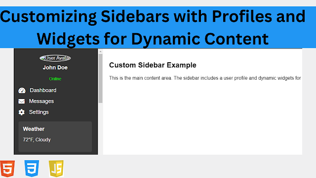
We’ll start by creating the basic structure of the sidebar, which will include a user profile section at the top and various widgets for dynamic content.
<!DOCTYPE html>
<html lang="en">
<head>
  <meta charset="UTF-8">
  <meta name="viewport" content="width=device-width, initial-scale=1.0">
  <title>Custom Sidebar with Profile and Widgets</title>
  <link rel="stylesheet" href="https://cdnjs.cloudflare.com/ajax/libs/font-awesome/6.0.0-beta3/css/all.min.css">
  <link rel="stylesheet" href="styles.css">
</head>
<body>

  <!-- Custom Sidebar with User Profile and Widgets -->
  <div id="sidebar" class="sidebar">
    <!-- User Profile Section -->
    <div class="user-profile">
      <img src="user-avatar.jpg" alt="User Avatar" class="user-avatar">
      <h3 class="username">John Doe</h3>
      <p class="user-status">Online</p>
    </div>

    <!-- Navigation Links -->
    <ul class="nav-links">
      <li><a href="#dashboard"><i class="fas fa-tachometer-alt"></i><span>Dashboard</span></a></li>
      <li><a href="#messages"><i class="fas fa-envelope"></i><span>Messages</span></a></li>
      <li><a href="#settings"><i class="fas fa-cog"></i><span>Settings</span></a></li>
    </ul>

    <!-- Widgets Section -->
    <div class="widgets">
      <!-- Weather Widget -->
      <div class="widget weather-widget">
        <h4>Weather</h4>
        <p>75°F, Sunny</p>
      </div>

      <!-- Recent Activity Widget -->
      <div class="widget recent-activity-widget">
        <h4>Recent Activity</h4>
        <ul>
          <li>Posted a new article</li>
          <li>Updated profile picture</li>
          <li>Commented on a blog post</li>
        </ul>
      </div>

      <!-- Notifications Widget -->
      <div class="widget notifications-widget">
        <h4>Notifications</h4>
        <ul>
          <li>3 new messages</li>
          <li>1 friend request</li>
          <li>2 event invites</li>
        </ul>
      </div>
    </div>
  </div>

  <!-- Main Content Area -->
  <div class="content">
    <h2>Custom Sidebar Example</h2>
    <p>This is the main content area. The sidebar includes a user profile and dynamic widgets for a more interactive experience.</p>
  </div>

</body>
</html>
Explanation of the HTML Structure:
User Profile Section:
- The sidebar begins with a user profile section, displaying the user's avatar, name, and status (e.g., "Online"). This section can be dynamically updated based on the logged-in user.
Navigation Links:
- The sidebar contains standard navigation links with icons (e.g., Dashboard, Messages, Settings) to allow users to access different parts of the web application.
Widgets Section:
- The sidebar includes several widgets, such as a weather widget, a recent activity widget, and a notifications widget. These widgets provide dynamic content to enhance the sidebar’s utility.
2. CSS for Styling the Sidebar with User Profiles and Widgets
Next, we’ll style the sidebar to make it visually appealing. We’ll focus on the layout, typography, and responsiveness of the user profile section, navigation links, and widgets.
/* styles.css */

/* General Styling */
body, html {
  margin: 0;
  padding: 0;
  font-family: Arial, sans-serif;
  height: 100%;
  display: flex;
}

/* Sidebar Styling */
.sidebar {
  width: 300px;
  background-color: #333;
  color: white;
  height: 100vh;
  position: fixed;
  left: 0;
  top: 0;
  padding: 20px;
  box-sizing: border-box;
  overflow-y: auto;
}

/* User Profile Section */
.user-profile {
  text-align: center;
  margin-bottom: 20px;
}

.user-avatar {
  width: 80px;
  height: 80px;
  border-radius: 50%;
  border: 2px solid #fff;
}

.username {
  margin-top: 10px;
  font-size: 18px;
  color: white;
}

.user-status {
  font-size: 14px;
  color: #00ff00;
}

/* Navigation Links */
.nav-links {
  list-style-type: none;
  padding: 0;
  margin-bottom: 20px;
}

.nav-links li {
  margin-bottom: 15px;
}

.nav-links li a {
  color: white;
  text-decoration: none;
  font-size: 18px;
  display: flex;
  align-items: center;
}

.nav-links li a i {
  margin-right: 15px;
  font-size: 20px;
}

.nav-links li a:hover {
  color: #007bff;
}

/* Widgets Section */
.widgets {
  margin-top: 20px;
}

.widget {
  background-color: #444;
  padding: 15px;
  border-radius: 5px;
  margin-bottom: 20px;
}

.widget h4 {
  margin: 0 0 10px;
  font-size: 18px;
  color: white;
}

.widget p,
.widget ul {
  font-size: 16px;
  color: white;
}

.widget ul {
  padding: 0;
  list-style-type: none;
}

.widget ul li {
  margin-bottom: 5px;
}

/* Content Area Styling */
.content {
  margin-left: 300px;
  padding: 20px;
}
Explanation of the CSS:
User Profile Section:
- The profile section is centered with the user’s avatar styled as a circle (
border-radius: 50%), giving a clean and visually appealing design. The username and status are displayed directly beneath the avatar.
- The profile section is centered with the user’s avatar styled as a circle (
Navigation Links:
- The navigation links are aligned using Font Awesome icons and text, with a hover effect that changes the link color to blue (
#007bff) for better interactivity.
- The navigation links are aligned using Font Awesome icons and text, with a hover effect that changes the link color to blue (
Widgets Section:
- Each widget is styled with a background color (
#444) and padding for a card-like appearance. Widgets include headings (h4) and text content, making it easy for users to access dynamic information (e.g., weather, notifications, recent activity).
- Each widget is styled with a background color (
3. JavaScript for Dynamic Widgets
Now, we’ll add JavaScript to simulate dynamic content for the widgets. For example, we can fetch the weather from an API, display notifications, or update recent activity dynamically.
// scripts.js

// Example: Simulate fetching dynamic content
document.addEventListener('DOMContentLoaded', function() {
  // Simulate dynamic weather update
  const weatherWidget = document.querySelector('.weather-widget p');
  weatherWidget.textContent = '72°F, Cloudy'; // Dynamic weather data

  // Simulate recent activity updates
  const recentActivityWidget = document.querySelector('.recent-activity-widget ul');
  recentActivityWidget.innerHTML += '<li>Joined a new group</li>';

  // Simulate notification updates
  const notificationsWidget = document.querySelector('.notifications-widget ul');
  notificationsWidget.innerHTML += '<li>5 new likes on your post</li>';
});
Explanation of the JavaScript:
- Simulate Dynamic Content:
- When the page loads (
DOMContentLoaded), the weather widget is dynamically updated with new weather information, and both the recent activity and notifications widgets are updated with additional simulated content.
- When the page loads (
4. Making the Sidebar Responsive
We’ll add a media query to ensure that the sidebar behaves well on smaller screens, making it responsive for mobile devices.
/* Media Query for Smaller Screens */
@media screen and (max-width: 768px) {
  .sidebar {
    width: 200px; /* Narrower sidebar for smaller screens */
  }

  .content {
    margin-left: 200px;
  }

  .user-avatar {
    width: 60px;
    height: 60px;
  }

  .username {
    font-size: 16px;
  }
}
Explanation of the Media Query:
Responsive Sidebar for Mobile Devices:
- On smaller screens (below
768px), the sidebar width is reduced to200px, and the avatar and username font sizes are adjusted to maintain a balanced layout.
- On smaller screens (below
Content Area Adjustment:
- The content area’s left margin is reduced to
200pxto match the smaller sidebar width, ensuring the layout remains consistent.
- The content area’s left margin is reduced to
Best Practices for Designing Custom Sidebars with Profiles and Widgets
To ensure your sidebar is both functional and user-friendly, follow these best practices:
1. Personalize the User Experience
Incorporate user-specific data such as profiles, avatars, and statuses. This helps create a sense of connection and improves engagement by making the sidebar more relevant to the user.
2. Use Interactive Widgets
Widgets should display dynamic content that is relevant to the user. Examples include weather updates, notifications, and recent activity. Use APIs to fetch real-time data when possible.
3. Ensure Accessibility
Ensure that the sidebar is accessible by using ARIA labels and making it keyboard navigable. This will improve the experience for users who rely on assistive technologies.
<nav aria-label="Sidebar Navigation">
  <ul class="nav-links">
    <li><a href="#dashboard">Dashboard</a></li>
  </ul>
</nav>
4. Optimize for Mobile Devices
Ensure the sidebar is responsive and works well on mobile devices by adjusting the layout and widget sizes for smaller screens. Make sure the sidebar doesn’t take up too much screen space on mobile devices.
Live preview
See the Pen Customizing Sidebars with User Profiles and Widgets for Dynamic Content by codepen (@codepen-the-selector) on CodePen.