
Introduction to Footer design
The footer is a vital part of web design, enhancing user experience and providing key information. It offers navigation links to improve accessibility, directing users to essential sections on long pages. Including contact details, such as email and phone numbers, fosters trust and facilitates communication. Social media icons in footers promote engagement, connecting users to brands across platforms. Additionally, copyright information asserts ownership and ensures legal compliance in the digital space. By thoughtfully incorporating these elements, footers contribute to a website’s usability and help meet visitors’ informational needs, making them an essential component of effective web design.
Building the HTML Structure for the Footer
Creating an effective footer begins with a clear understanding of the appropriate semantic HTML tags that contribute to both usability and accessibility. The primary tag utilized for the footer is the <footer> tag, which identifies the footer section of the webpage. It is imperative to use this tag to ensure that search engines and assistive technologies recognize the content’s purpose.
Furthermore, integration of social media icons within the footer enhances engagement opportunities.
<!DOCTYPE html>
<html lang="en">
<head>
<meta charset="UTF-8">
<meta name="viewport" content="width=device-width, initial-scale=1.0">
<title>Responsive Footer Section</title>
<link rel="stylesheet" href="styles.css">
</head>
<body>
<div class="site_page">
<div class="container">
<div class="top_container">
<div class="left_container">
<div class="left_top_container">
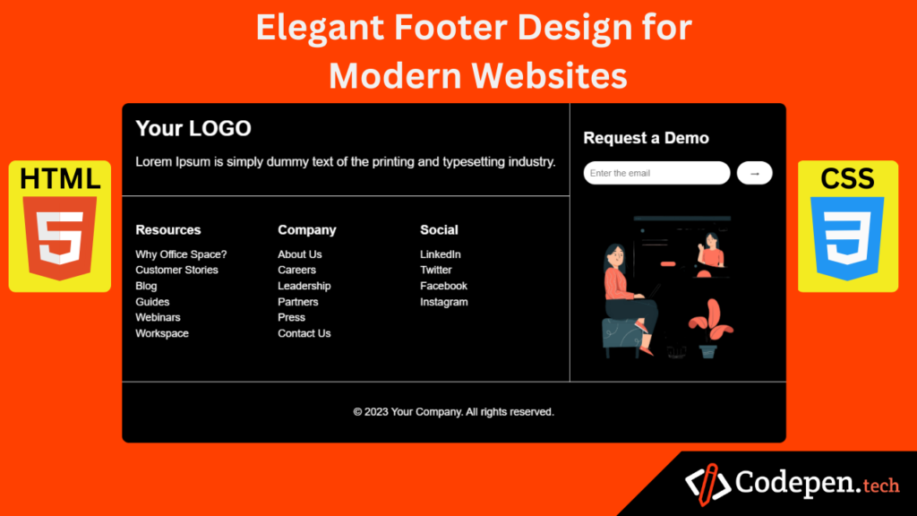
<div class="logo">Your LOGO</div>
<p class="description">Lorem Ipsum is simply dummy text of the printing and typesetting industry.</p>
</div>
<div class="left_bottom_container">
<div class="footer-section resources">
<h3>Resources</h3>
<ul>
<li>Why Office Space?</li>
<li>Customer Stories</li>
<li>Blog</li>
<li>Guides</li>
<li>Webinars</li>
<li>Workspace</li>
</ul>
</div>
<div class="footer-section company">
<h3>Company</h3>
<ul>
<li>About Us</li>
<li>Careers</li>
<li>Leadership</li>
<li>Partners</li>
<li>Press</li>
<li>Contact Us</li>
</ul>
</div>
<div class="footer-section social">
<h3>Social</h3>
<ul>
<li>LinkedIn</li>
<li>Twitter</li>
<li>Facebook</li>
<li>Instagram</li>
</ul>
</div>
</div>
</div>
<div class="right_container">
<h2>Request a Demo</h2>
<div class="input-box">
<input type="email" placeholder="Enter the email">
<button>→</button>
</div>
<img class="illustration" src="assets/girl wit laptop.png" alt="">
</div>
</div>
<div class="bottom_container">
<p>© 2023 Your Company. All rights reserved.</p>
</div>
</div>
</div>
</body>
</html>
A well-designed footer not only improves website navigation but also enhances user experience by offering key information like contact details, privacy policy, and social media links. For best practices, check out resources from Smashing Magazine or W3Schools.
Styling the Footer with CSS
Incorporating CSS into your footer design is essential to ensure it not only complements the overall aesthetic of your website but also maintains functionality. To start, apply a flexbox layout for alignment. The display: flex; property can be set on the footer container, allowing child elements to be easily aligned both horizontally and vertically. For example:
/* General Styles */
body {
    font-family: Arial, sans-serif;
    margin: 0;
    padding: 0;
    box-sizing: border-box;
    color: #fff;
    background-color: #ff4000;
    align-items: flex-end;
    display: flex;
    justify-content: space-around;
}
.site_page{
    width: 100%;
    height: max-content;
    display: flex;
    justify-content: center;
    align-items: center;
    margin: 0 auto;
    top: 100px;
    position: absolute;
}
.container {
    margin: 0px;
    padding: 0px;
    background-color: rgb(0, 0, 0);
    border-radius: 10px;
}

.top_container{
    display: flex;
    flex-direction: row;
}
.left_top_container{
    padding: 20px;
}
.left_bottom_container{
    padding: 20px;
    display: flex;
    gap: 10px;
    border-top: 1px solid white;
}
.right_container{
    border-left: 1px solid white;
    padding: 20px;
}
.bottom_container{
    text-align: center;
    padding: 20px;
    border-top: 1px solid white;
}

.logo {
    font-size: 2rem;
    font-weight: bold;
}

.description {
    font-size: 1.2rem;
}

.demo {
    text-align: center;
}

.demo h2 {
    margin-bottom: 10px;
}

.input-box {
    display: flex;
    justify-content: center;
    gap: 10px;
}

.input-box input {
    padding: 10px;
    border-radius: 20px;
    border: none;
    outline: none;
    width: 200px;
}

.input-box button {
    padding: 10px 20px;
    border-radius: 20px;
    border: none;
    background-color: #ffffff;
    color: rgb(0, 0, 0);
    cursor: pointer;
}

.footer-section {
    flex: 1;
}

.footer-section h3 {
    font-size: 1.2rem;
    margin-bottom: 10px;
}

.footer-section ul {
    list-style: none;
    padding: 0;
}

.footer-section li {
    margin-bottom: 5px;
}
.footer-section li:hover{
    cursor: pointer;
    color: rgb(225, 255, 0);
    font-size: 18px;
}

/* Illustration */
.illustration {
    text-align: center;
    margin-top: 20px;
}

.illustration img {
    max-width: 100%;
    height: auto;
}
.illustration{
    max-width: 250px;
}

/* Responsive Design */
@media (max-width: 768px) {
    .top_container{
        display: flex;
        flex-direction: column;
    }
    .left_top_container{
        text-align: center;
    }
    .left_bottom_container{
        flex-direction: column;
    }
    .right_container{
        border-left: none;
        border-top: 1px solid white;
    }

    .footer {
        flex-direction: column;
        align-items: center;
    }

    .footer-section {
        text-align: center;
        margin-bottom: 20px;
    }

    .input-box input {
        width: 100%;
    }
    .illustration{
        display: none;
    }
}
This implementation creates a clean layout for logo placement on one side and navigation links on the other, enhancing usability.
Attachments
Your download will begin shortly…
30 seconds remaining
Conclusion:
Best Practices and Final Thoughts
This tutorial highlights the importance of footer design in enhancing user experience and website navigation. A well-crafted footer provides essential information, promotes usability, and supports brand identity. Simplicity is key—keeping footers clean, uncluttered, and mobile-responsive ensures clarity and accessibility across devices. Regular updates to links, contact details, and social media icons maintain relevance and build trust with users. Incorporating unique, brand-aligned elements personalizes the experience and fosters deeper connections. By following these practices and applying the tutorial’s insights, designers can create footers that enhance both functionality and aesthetics, contributing to a website’s success.