
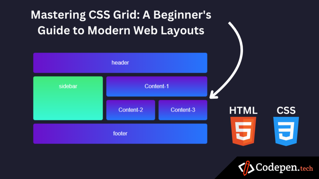
Table of Contents
Introduction
CSS Grid Layout is a powerful and flexible layout system that enables developers to create responsive and complex web designs with ease. By leveraging its two-dimensional grid-based approach, developers can organize content into rows and columns, achieving layouts that are both efficient and visually appealing. provides greater control over alignment, spacing, and placement compared to traditional layout methods like floats or inline-block. This article will explain the fundamental principles, complete with sample HTML and CSS code to help you understand how to implement it effectively in your projects. Whether you’re building a simple website or a complex web application, CSS Grid can simplify your workflow and enhance your design capabilities.
Sample HTML Code
To implement, let’s start with a basic HTML structure. Here’s a simple example:
<!DOCTYPE html>
<html lang="en">
<head>
  <meta charset="UTF-8">
  <meta name="viewport" content="width=device-width, initial-scale=1.0">
  <title>CSS Grid Layout</title>
  <link rel="stylesheet" href="styles.css">
</head>
<body>
  <div class="grid-container">
    <div class="header">header</div>
    <div class="sidebar">sidebar</div>
    <div class="content-1">Content-1</div>
    <div class="content-2">Content-2</div>
    <div class="content-3">Content-3</div>
    <div class="footer">footer</div>
  </div>
</body>
</html>
CSS Code for Grid Layout
Once you have the HTML structure in place, you can add CSS to define the layout. Here’s an example of the CSS code:
* {
    margin: 0;
    padding: 0;
    box-sizing: border-box;
  }

  body {
    font-family: Arial, sans-serif;
    background-color: #1e1e2f;
    color: white;
    display: flex;
    justify-content: center;
    align-items: center;
    min-height: 100vh;
  }

  .grid-container {
    display: grid;
    grid-template-columns: 200px 1fr 1fr;
    grid-template-rows: auto 1fr 1fr auto;
    gap: 10px;
    width: 80%;
    max-width: 500px;
  }

  .grid-container div {
    transition: transform 0.3s ease, box-shadow 0.3s ease;
    border-radius: 5px;
  }

  /* Glow effect on hover */
  .grid-container div:hover {
    transform: translateY(-5px);
    box-shadow: 0 0 20px 5px rgba(255, 255, 255, 0.5);
  }

  .header {
    grid-column: 1 / 4;
    background: linear-gradient(to right, #6a11cb, #2575fc);
    text-align: center;
    padding: 20px;
  }

  .sidebar {
    grid-column: 1 / 2;
    grid-row: 2 / 4;
    background: linear-gradient(to bottom, #43e97b, #38f9d7);
    text-align: center;
    padding: 20px;
  }

  .content-1 {
    grid-column: 2 / 4;
    grid-row: 2 / 3;
    background: linear-gradient(to bottom, #6a11cb, #2575fc);
    text-align: center;
    padding: 20px;
  }

  .content-2 {
    grid-column: 2 / 3;
    grid-row: 3 / 4;
    background: linear-gradient(to bottom, #6a11cb, #2575fc);
    text-align: center;
    padding: 20px;
  }

  .content-3 {
    grid-column: 3 / 4;
    grid-row: 3 / 4;
    background: linear-gradient(to bottom, #6a11cb, #2575fc);
    text-align: center;
    padding: 20px;
  }

  .footer {
    grid-column: 1 / 4;
    background: linear-gradient(to right, #6a11cb, #2575fc);
    text-align: center;
    padding: 20px;
  }
To learn CSS enhances the form’s visual appeal, making it more user-friendly. To explore more CSS properties and their applications, visit this site MDN CSS Tutorial.
Attachment
Your download will begin shortly…
30 seconds remaining
Conclusion
CSS Grid significantly simplifies the process of creating complex web layouts, offering developers precise control over both rows and columns. Its grid-based structure allows for flexible and responsive designs that adapt seamlessly to different screen sizes. By utilizing the provided HTML and CSS code examples, you can start experimenting with CSS Grid’s powerful features, such as grid-template areas, alignment, and auto-placement. This system streamlines tasks that previously required extensive workarounds, saving time and effort. To fully harness its potential, explore additional resources online, including tutorials, documentation, and real-world examples to enhance your understanding and skills